


In the realm of web optimization, the age-old wisdom of "analyze before optimizing" remains a guiding principle. But what exactly should we be dissecting in this process? The answer to this question hinges on our quest to unravel the intricate dance of HTML documents, where pixels are choreographed on a multitude of devices, culminating in the display of the coveted web content. It's here that the spotlight falls squarely on CRP, or Content Rendering Path, as the linchpin of this fascinating journey.
For further insights or to delve deeper into this intriguing subject, don't hesitate to reach out. We're here to keep you informed on all things tech!
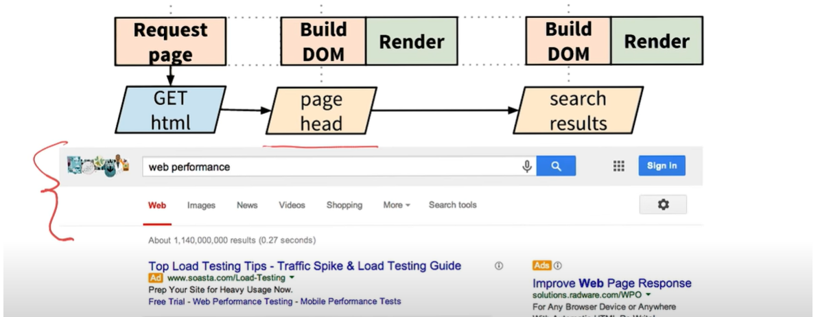
The Critical Rendering Path

As depicted in the image above, it's evident that each webpage on the Document Object Model (DOM) must navigate a distinct route, aptly named the Content Rendering Path or CRP. This pathway is a critical element in the web rendering process, and understanding it is pivotal for optimizing web performance.
Creation of Document Object Model

The steps are as follows:

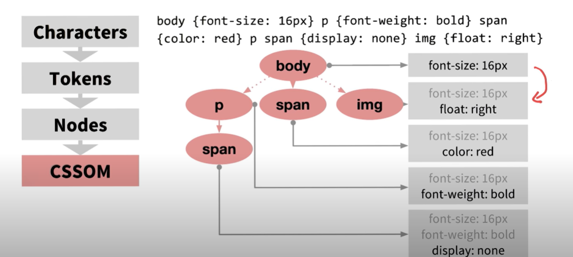
Step1- Tokenizer creates the tokens

Step-2 DOM nodes are created

Step-3 DOM tree is created after linking the nodes as per the hierarchy of HTML elements

Incremental HTML delivery
Building upon the previous discussion, the elements enclosed in brackets, encompassing the search bar, tabs, and app bar at the top of the page, are deemed common components. As a result, they are pre-rendered through a server cache call, expediting their display. Subsequently, the remaining content, as described below, is sequentially rendered on the Document Object Model (DOM). This deliberate approach serves as an optimization strategy to enhance overall performance.
CSSOM (CSS Object Model)
You've made a precise observation. Just as the Document Object Model (DOM) comprises HTML node elements, the CSS Object Model (CSSOM) is crafted from CSS attributes and selectors. These two entities work in tandem to bring about the visual representation of a web page, with DOM handling the structure and content, while CSSOM governs the presentation and styling. Understanding this synergy is crucial in web development for achieving the desired layout and aesthetics.

The CSS Object Model (CSSOM) relies on the hierarchical structure of HTML DOM node elements. The impact of a CSS property is primarily determined by its specificity. Specificity dictates which style rules are applied when there are multiple competing rules targeting the same element. The more specific a selector is, the higher its precedence in styling the element. Understanding specificity is crucial for developers to control and manage the visual presentation of web content effectively.
Measure and analyze the timeline/performance

A succinct breakdown of the key components involved in rendering a web page:
DOM (Document Object Model) represents the HTML elements and their hierarchical structure.
CSSOM (CSS Object Model) manages the CSS stylings and rules.
The render tree, often referred to as the "rendering tree," is an intermediate stage that combines the information from the DOM and the CSSOM. It represents the elements that will be displayed on the screen.
It's accurate to say that the render tree is the final product derived from the union of DOM and CSSOM. It serves as the blueprint for rendering the web page and determining the visual layout and presentation. Understanding these components is essential for effective web development and optimization.

Device pixel role
When it comes to maintaining content integrity even when the screen is rotated, the credit goes to a specific HTML meta tag. This meta tag, known as the "viewport meta tag," plays a pivotal role in ensuring that content remains undistorted. It allows you to control how web pages are displayed on a variety of devices and screen orientations, enabling a consistent and user-friendly experience.
<meta name="viewport" content="width=device-width"/>
This meta tag ensures content remains visible without the need for manual zooming on rotated screens.
Must use the above meta tag
Layout role in web optimization
When we refer to "layout," we're talking about the portrait and landscape orientations. Switching between these layouts triggers the recreation of the render tree, which can impact performance.
On a single page, you might notice multiple layout parameters in the performance console. Each layout change initiates the recreation of the layout tree, resulting in a slight performance degradation.

To manage the issue of multiple layout creations stemming from prioritized rendering, a viable solution involves implementing batches and organizing similar priority tasks to be processed together on the render tree. This approach can help streamline and optimize the rendering process for improved performance.
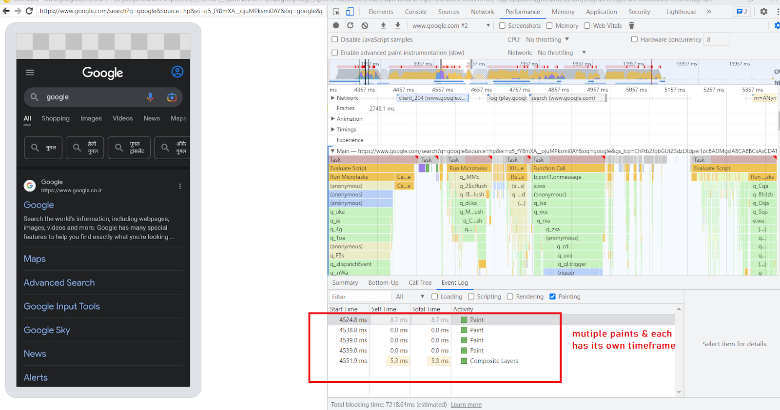
Painting the layout on the browser
The process of painting, which occurs concurrently with layout creation in the browser, is closely tied to the need for multiple layouts, as illustrated in the previous example. In this scenario, multiple paints are indeed necessary within the specified time frame.
What's noteworthy is the browser's intelligent approach. Rather than repainting the entire screen from scratch each time, it strives to repaint only the sections that have undergone changes. This optimization helps enhance the efficiency of rendering and contributes to a smoother user experience.
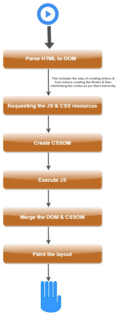
Summarize the journey of a page on the Browser screen
Important note: When utilizing inline CSS, there is no need for a separate CSS request, as the styling information is directly embedded within the HTML. However, if external CSS is used, it will be requested from the server as a separate resource. This distinction is vital for understanding how styles are applied to web content.
So far we have seen the CRP i.e critical rendering path & how it flows & how we can analyze the CRP of our webpage.
Now we will be talking about its optimization.
Optimizing the CRP
Optimizing a web page often involves a multi-step process. Beginning with the HTML, the initial step is to make it as compact as possible. To achieve this, we can implement three key processes on the HTML content:
Minification: This involves removing unnecessary spaces, line breaks, and other redundant characters, reducing the size of the HTML file.
Compression: Using techniques like Gzip compression, the HTML file can be further compressed for faster delivery to the browser, minimizing load times.
Caching: By caching the HTML file, the browser can store a copy locally, reducing the need for repeated requests to the server and accelerating page loading for return visitors.
Implementing these processes can significantly enhance the performance and speed of a website.
Minification:
The minification process for HTML documents employs various methods and algorithms, all with the singular aim of reducing file size. Several observable mechanisms include:
Removing Unwanted Information: This involves stripping out elements such as comments and extra spaces, which don't impact the functionality of the HTML but add to its file size.
Regulated Encoding: Certain encoding techniques can be applied to compress the HTML content in a controlled manner, further reducing the overall file size.
These practices ensure that the HTML remains functional while being more efficient in terms of data transfer and loading speed.
Before
    # Below is a secret message, which consists of a set of headers in
    # key-value format followed by a newline and the encrypted message.
    format: secret-cipher
    date: 08/25/16
    AAAZZBBBBEEEMMM EEETTTAAA
After
format: secret-cipher
date: 08/25/16
3A2Z4B3E3M 3E3T3A
Encoding in the last text where AAA is converted to 3A
Here minification is done by 52%.
Note we can't delete any information from the targetted file. So it should be content-specific optimization.
For example,
Consider a photograph captured with a high-end camera. This image typically includes metadata such as the date, time, location, image ratio, and even the focal length of the lens used. However, when sharing this image via an app like WhatsApp, a significant reduction in file size occurs. This reduction is due to the removal of non-essential metadata, as these details hold little relevance within the context of a chat application.
Compression:
Achieving efficient compression, akin to tools like GZIP, can be accomplished through several means:
Server Configuration: Configure your server to enable GZIP compression for the content it serves.
Browser Settings: Ensure that GZIP compression is enabled in the browser to decode and display the compressed content.
CDN Configuration: If you're using a Content Delivery Network (CDN), make sure it's configured to deliver content in GZIP-compressed form.
In summary, the optimization process can be distilled into two major steps:
Content-Specific Optimization: This involves the minification process, which streamlines the content by removing unnecessary elements.
GZIP Compression: The minified content is further compressed using techniques like GZIP to reduce file size for efficient transmission.
It's worth noting that many servers and browsers are already equipped to handle GZIP compression by default. You can easily verify this in the network tab of your browser by hovering over the size column to confirm the compression applied to the files being loaded.

As a default practice, web servers typically transmit data and information in their gzipped, compressed form. When inspecting the size column in the browser console, the displayed size corresponds to the non-compressed file size, but it's important to note that the initial transmission occurs in the compressed size, enhancing data transfer efficiency.
The effectiveness of the gzipped file size becomes evident when reviewing the table below, which provides a comparison of the actual and compressed sizes for well-known libraries. This data serves as a compelling illustration of the substantial size reduction achieved through compression, underscoring its pivotal role in optimizing web performance.
These statistics highlight the significant reduction in file size, resulting in faster load times and an enhanced user experience.

The efficient transmission of compressed files relies on two essential pillars: web browsers, which request the compressed files, and web servers, responsible for delivering these compressed files. While this process is typically automatic, there are situations where manual configuration becomes necessary. For instance, when dealing with files smaller than the gzipped threshold, you might need to adjust the configuration to set the threshold size for GZIP compression. This ensures that even smaller files benefit from the advantages of compression and faster data transfer.
HTTP Caching:
Before delving into the realm of HTTP caching, it's essential to grasp the concept of "caching" and its broader applications.
What is Caching: Caching is a strategic mechanism employed to store frequently accessed information in the nearest available storage. The primary objective is to curtail the need for frequent API or database calls, consequently reducing the latency associated with request and response handshaking. The goal is to streamline and expedite data retrieval and delivery.
Where Caching Occurs: Caching is a versatile practice with applications in various areas. It can be implemented at different levels:
Client-Side Caching: This involves storing cached data in the client's browser, enhancing user experience by reducing the need for repeated requests to the server.
Frontend Server Caching (BFF): For architectures with a Backend for Frontend (BFF), caching can be done at the frontend server level to optimize data retrieval and transmission.
Web Server Caching: Robust caching solutions like Memcached or Redis are employed at the web server level, boosting performance by minimizing database queries.
Proxy & Reverse Proxy Servers: Caching can also be applied in proxy and reverse proxy servers, further improving response times and reducing the load on backend systems.
How Caching Works: The caching mechanism is straightforward, yet it incorporates important terminologies and practices. Detailed insights into these elements can be found in the accompanying images below, shedding light on the intricacies of caching.
Understanding caching and its strategic application is pivotal in the realm of web optimization and performance enhancement. The mechanism is simple but uses some important terminologies which we can see in the images below

Fresh API call & when the cached information is not present on the client side or if the cached information is invalidated, then in such case, we will be able to observe the above control flow.

Now, once the API call has been made and we can find the information in above mentioned Cache system, then in such a case we’ll save an API call as per the above visible situation.
How caching process flow?
In a good API pathway, we usually have the cache at all 3 building blocks i.e. on the client side, proxy, reverse proxy & web server.

So, following the above image’s data flow when the server sends the response it also sends the response header which has some information that will be responsible for the validation and revalidation of the cache.

In the earlier response header, various attributes were presented, but for our discussion, we will focus exclusively on the cache-related attributes. These attributes can be categorized into two types:
Content Headers:
Expires
Pragma
Cache-Control
Validator Headers:
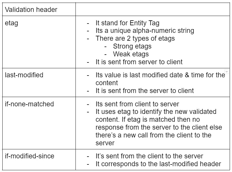
Etag
If-None-Match
Last-Modified
If-Modified-Since
These cache-related attributes play a pivotal role in controlling how web content is cached and delivered, ultimately influencing the performance and behavior of web applications.

cache-control values:
Here's a tabular explanation of the Cache-Control values:
| Cache-Control Value | Description |
| Public | The cache can be stored in public places, such as proxies. |
| Private | Caching is restricted to the client side only. |
| No-Store | No caching is allowed, necessitating an API call to the server always. |
| No-Cache | Caching is permitted, but the content must be revalidated with the server. |
| Max-Age | Specifies the maximum age for the cache to be considered valid. |
| S-Max-Age | The "S" indicates it determines the max-age of the cache at shared locations, such as proxies. |
| Must-Revalidate | Content must always be revalidated with the server before serving it. |
| Proxy-Revalidate | Revalidation must occur on the server side, while the client can serve stale content in the meantime. |
Examples: Cache-control: max-age=600, proxy-revalidate
Meaning: Maximum age on the client side is 600 ms & after the expiry i.e. 600 ms, there will be a proxy-revalidation i.e revalidation on the proxy level
Cache-control: max-age=600, s-max-age:3600, public, must-revalidate
Meaning: The maximum age of cache on the client side is 600 ms & 3600 ms is the expiry time on the server side,
The caching is allowed at the client and the proxy level too,
Revalidation is required when the cache is expired
Now 2 questions should what if:
Both the headers i.e etag & last-modified is used
- In this case, both validations i.e if-none-matched & if-modified-since are applied
None of the headers are applied
- In this case, no validation is applied at all
Which type of HTTP caching is best?
Like any other engineering answer its answer is also the same and that is it entirely depends on the use case.
Case-1:
So let's say we have some dynamic content to be shown on the browser then, in this case, we’ll have light caching. Where revalidation is to be done on every request.
Case-2:
When users have information like a news feed that is hourly updated then, in this case, we will have content-type as public for max-age & s-max-age as 3600 ms
Case-3:
Let's say we are serving static content like image assets or fonts. Then in this case we will have hard caching. Where revalidation can be stopped once content is delivered.
CSS impact on Content rendering path (CRP)
Notes that a CSS file when included inside the HTML file is by a
<link rel = “stylesheet” href=”styles.css” />
So as we discussed first HTML DOM will be created and then the CSSOM & then the painting on DOM will start. Hence, there will be a halt to DOM paint with complete content on DOM i.e. unless the CSSOM is created.
Now the question may come that what would happen to any CSS file import that looks like this:
@media screen and (orientation: landscape) {
  font-size: 12px;
}

@media print {
  background: red;
}
In the above case, there will be CRP blockage because of “print” specific changes i.e that CSS will not be part of CSSOM unless that becomes part of the need.
Hence it is recommended to divide the CSS into multiple styling files.

CSS can be a blocker to CRP construction hence we can avoid it by the correct usage of Media queries, and break-points & by putting CSS content in separate files
Javascript causing the blockage in CRP
Normal DOM & CSSOM creation can be as the following diagram:
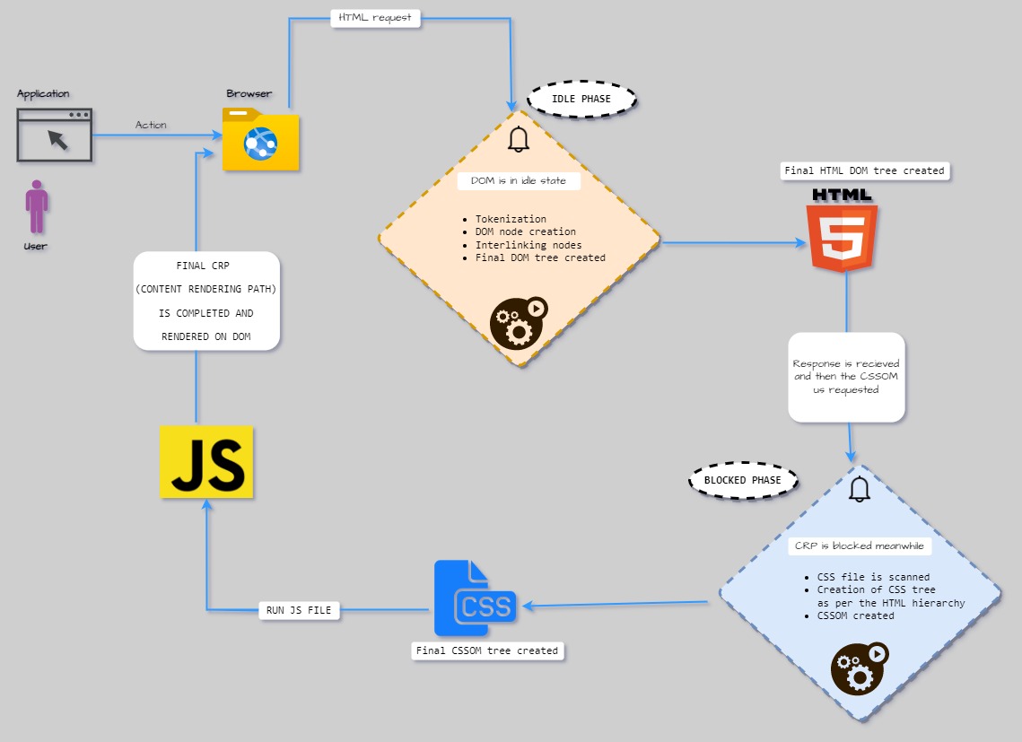
As per the above diagram, we can clearly observe that there is a clear need for CSS & JS optimization so that we can minimize the delay in CRP creation.
There can 3 ways of introducing JS on our website:
** Inline **
Inline JS means we will be able to see any JS snippet inside our HTML element, hence we’ll observe that there is NO blocking for CRP because now our <script> has become inlined with our HTML
But one huge drawback in implementing Inline JS is that we’ll not be able to write a scalable codebase, because of code repetition & as a result heavier HTML pages.
<body>
  <button id="test">
    Click here
  </button>
  <h4>
    Hello world
    <script>
      const el = document.getElementById("test");
      el.style.backgroundColor = "red"
      el.addEventListener("click",()=>{console.log("hit")})
    </script>
  </h4>
</body>
** Blocking **
Let’s say we have the same implementation as that of inline but we’ll import the JS from an external file source. Hence it will cause a block to CRP because fetching the JS files will take time.
Not a recommended way to write the JS code.
But there can be one sneak-peak even in this situation & that is by putting JS import above CSS import, hence at least we’ll be safe from blocking CSSOM creation.
<body>
  <button id="test">
    Click here
  </button>
  <h4>
    Hello world
    <script src="./test.js" ></script>
  </h4>
</body>
** Async **
This is the best pathway to import we have to import any information that might take some time & hence, it will be imported asynchronously i.e. without blocking any import or CRP creation.
<head>
  <meta charset="UTF-8">
  <meta http-equiv="X-UA-Compatible" content="IE=edge">
  <meta name="viewport" content="width=device-width, initial-scale=1.0">
  <link href="./styles.css" rel="stylesheet"/>
  <script src="./test.js" async></script>
  <title>Document</title>
</head>
Summary of actions we can do to achieve optimization
Minify the bytes traveling through the process by Minification, Compression & Caching
Optimize CSS to reduce delay in CRP by the usage of inline CSS & media-queries
Optimize JS to reduce delay in the parsing process by using async & differ to <script/> tags
Try to reduce the length of CRP
Here length means three basic aspects of any website or web page i.e HTML size, CSS imports & JS imports which have a direct impact that how long it will take to create the CRP
To create a matrix on above mentioned 3 points we can have the following 3 parameters
No. of critical resources (Count no. of HTML, CSS, JS imports)
Total critical kilobytes (Add size of all HTML, CSS & JS)
Minimum critical paths (Count no. of requests to be made)
** Example: **

Preload Scanner
Let's say we have a code base as follows
<head>
  <meta charset="UTF-8">
  <meta http-equiv="X-UA-Compatible" content="IE=edge">
  <meta name="viewport" content="width=device-width, initial-scale=1.0">
  <link href="./styles.css" rel="stylesheet"/>
  <script src="./test1.js" ></script>
  <script src="./test2.js" ></script>
  <title>Document</title>
</head>
If we see the above codebase and try to create the CRP for the same then we’ll see that we can have pathways like:

So as per the above diagram, we can observe that we will have a power provided by a browser called Preload Scanner & how it behaves is that it will import all critical resources & if it finds that there are some more resources to be imported then it will not wait for the process for CRP creation to be completed, instead, it will start the preloading process while carrying out the CRP creation.
Numerical
If the size of your file is 100KB then how long it will take to download that file if we have 10 as the initial congestion path, the size of each packet is 1460 bytes & round-trip time is 100 ms?
** Solution **
Size of file = 100KB
Size of each packet = 1460
Total bytes in the file = 100*1024 bytes = 102400 bytes
Because the transaction is always in packets only. So,
No. of packets formed = 102400/size of each packet = 102400/1460 = 70
Total time taken to make the round-trip
\= Time taken by 1 round trip * (log (Size of each packet))
\= 100 * log(70/10)
\= 84.5 ms
Performance Optimization
In the realm of website performance, we grapple with three key components of any web page: HTML, CSS, and JavaScript.
In addition to these three pivotal components, we must also acknowledge the significant role played by various assets in determining web performance. These assets encompass images, videos, and fonts.
In a more focused examination of HTML, it becomes evident that as the page size increases, web performance begins to deteriorate. This decline is primarily attributed to the escalating consumption of resources involved in parsing the HTML documents into DOM nodes. Consequently, understanding and addressing these factors are vital in the pursuit of optimal web performance.
Network resource consumption
Before moving ahead I have a trick question for you. The question is as follows:
There are 2 cases:
Case-1
3 files of 300KB on network speed with 2mbps
Case-2
1 file of 900KB on network speed with 2mbps
So, which one will show more delay and which one will be less or they both will be the same with no difference?
So the answer is that Case-2 will be faster the reason is visible in the image shown below:

In the above-highlighted part, we can notice that there are many aspects that are involved in deciding the final time required for delivering a resource like Initial connection, DNS lookup, etc. So it's not just file size.
Hence we can conclude that if we have many small sizes of files then they will exhaust the network stability parameters and hence will be more expensive than a large file with only one network call.
Resource Download for CSS & JS
When it comes to downloading CSS and JS resources, several optimization techniques can be applied to enhance web performance. These techniques include:
Bundling: Combining multiple CSS or JS files into a single file to reduce the number of requests to the server, improving load times.
Minification: Minimizing the size of CSS and JS files by removing whitespace, comments, and unnecessary characters, which results in faster downloads.
Compression: Compressing CSS and JS files using techniques like Gzip or Brotli to reduce file sizes and accelerate transmission.
Caching: Implementing caching strategies to store CSS and JS files in the client's browser, reducing the need for repeated downloads.
For JavaScript, additional strategies such as:
Async Loading: Using the "async" attribute to load JavaScript resources asynchronously, preventing them from blocking the rendering of the page.
Defer Loading: Employing the "defer" attribute to load JavaScript files after the HTML content has been parsed, ensuring faster initial page rendering.
Lazy Loading: Delaying the loading of JavaScript resources until they are actually needed, optimizing the application's performance.
On the CSS front, "media queries" can be used to conditionally load styles based on the device's characteristics, further tailoring the user experience for different screen sizes and types.
These strategies collectively contribute to a more efficient and responsive web application, providing a better experience for users.
Image Optimization Techniques
Efficient image optimization is crucial for web performance. Here are some recommended techniques:
Use Compressed .jpg Format to Create .webp Images:
- Convert images to the .webp format, which offers excellent compression and quality. Use .webp images for banners and wide spaces.
Use .png for Icons Requiring a Background:
- Choose .png format for icons that require a background.
Use Other Formats (Not .png) for Icon Without Background:
- For icons without backgrounds, utilize formats other than .png to save on file size.
Use .svg for Icons, Logos, or Animations:
- Scalable Vector Graphics (.svg) is ideal for icons, logos, or animations.
Avoid .svg with Heavy Text:
- Be cautious with .svg files containing heavy text, as they can be relatively larger than text-free .svg files.
Compress Images Using Libraries or Online Tools:
- Utilize image compression libraries or online tools to reduce file sizes without compromising quality.
Use Sprites for .png Icons:
- Create sprites for .png icon files to reduce HTTP requests and improve load times.
Avoid .bmp Format:
- Avoid using the .bmp format for web pages, as it's not web-friendly due to its large file size.
Implement Lazy Loading:
- Implement lazy loading to load images only when they come into the user's viewport, reducing initial page load times.
Host Images in CDN:
- Host images on a Content Delivery Network (CDN) to leverage faster delivery and improved global access.
Host Images on the Same Server as the Web App:
- Whenever possible, host images on the same server as the web application to reduce latency and improve performance.
By applying these image optimization techniques, you can enhance your website's performance, reduce load times, and provide a smoother user experience.
Core Web Vitals
Core Web Vitals are essential metrics that play a pivotal role in achieving a strong Google ranking, which, in turn, enhances overall website performance and leads to improved Search Engine Optimization (SEO). These three major web vitals are:
LCP (largest contentful paint)
FID (first input display)
CLS (cumulative layout shift)
LCP (largest contentful paint)

LCP (Largest Contentful Paint):
Definition: The Largest Contentful Paint (LCP) is a metric that measures the time taken for the largest content element (which can be text, image, or video) above the fold to become visible on a web page. It's a critical indicator of a page's loading performance.
Key Points:
"Above the fold" refers to the content visible in the initial view without scrolling.
LCP is specific to a page, not the entire website.
LCP is calculated based on screen size and content visibility.
Ways to Improve LCP:
Improve Hosting: Choose a reliable hosting provider to ensure faster server response times.
Use CDN: Content Delivery Networks (CDNs) help in delivering assets from geographically closer servers.
Minification, Compression & Caching: Apply these techniques to reduce file sizes and optimize content delivery.
Avoid Heavy Animations: Minimize the use of animations, slides, or videos in the hero banner, as they can slow down page loading.
Use .webp Format: If images are essential in the hero banner, use the efficient .webp image format.
Implement "font-display: swap": Optimize font loading by swapping local fonts with your brand font.
Lazy Loading, Async, Defer JS: Load JavaScript asynchronously or defer its loading to prevent blocking of page rendering.
Follow Image Optimization Techniques: Utilize image optimization strategies to reduce image sizes.
Rely on Field Data, Not Lab Data: Base your performance analysis on field data from Google Analytics, which reflects real user experiences. Lab data from tools like GTmetrix or Lighthouse provides insights but may not represent actual user conditions.
Focusing on these measures can significantly enhance LCP, resulting in a faster, more user-friendly web experience.
FID (First Input Delay)
Definition: The First Input Delay (FID) is a metric that quantifies the delay between a user initiating an action and the actual response to that action. It measures the time gap between the user's interaction and when the system begins to process that interaction.
Example: For instance, when a user clicks on a button, several steps unfold. First, there's a 150ms calculation delay. Next, an API call is triggered, causing the button to enter a loading state for 200ms. Finally, the response modifies the DOM, taking 20ms to complete. In this scenario, the FID is calculated as 150ms, representing the time between the user's click and the start of action processing.
Key Points:
FID is intricately tied to user interactions and can only be accurately measured with field data.
Lab data analysis, conducted using time-to-block (TBT) data, can offer insights but might not capture real-world user experiences.
The FID metric exhibits a direct correlation with Time to Block (TBT).
Ways to Improve FID:
Optimize JavaScript: Efficient JavaScript coding and execution are crucial for reducing FID.
Avoid Main Thread Blockage: Preventing main thread blocking helps ensure quicker responses to user actions.
Leverage Service Workers: Service workers can offload tasks to background threads, enhancing responsiveness.
Use Optimized CSS: Well-optimized CSS contributes to smoother user interactions.
Minimize 3rd-Party Tools: Limit the use of third-party tools, such as Google Analytics or chat applications, to reduce potential delays associated with external services.
By addressing these aspects, you can significantly enhance FID, delivering a more responsive and user-friendly web experience.
CLS (cumulative layout shift)

Definition: Cumulative Layout Shift (CLS) occurs when there is an unexpected and disruptive shift in the layout of a web page, leading to a poor user experience. It often manifests as elements moving unexpectedly during the user's interaction with the site.
Observation: You can monitor CLS on the Performance tab of web development tools.
Ways to Mitigate CLS:
Remove Elements Causing CLS: If possible, eliminate or relocate elements that trigger layout shifts.
Fix Problematic Components: For elements that can't be removed, address issues that cause layout shifts.
Image Optimization: Ensure images have specific dimensions (width and height) to prevent layout shifts during loading.
Implement Skeleton Screens: Use skeleton screens, which provide placeholders for content, to minimize layout shifts during page load.
Font Management: Consider using system fonts or host custom fonts on the same server as your web application to avoid unexpected shifts caused by font loading.
Image Advertisements: Secure image ads in place to prevent layout shifts.
Lazy Load Ads: Load ads only when a user interacts with or scrolls through the page. Since CLS depends on user interactions, ensuring ads don't cause layout shifts without user interaction helps mitigate the issue.
By applying these measures, you can reduce CLS, leading to a more stable and user-friendly web experience.
Sayonara !!
In the world of web performance, remember: a faster website not only saves time but also preserves your sanity. So, let's speed up those load times and leave slow websites in the digital dust! Stay speedy and tech-tastic!